Design Snippets is an educational mini-series of blog posts describing all you need to know about basic elements and components of user interfaces from a design perspective.
A snippet is a programming term for a small region of re-usable source code, machine code, or text.
The second part of the series focuses on dropdowns, a widely familiar yet tricky user interface component that can quickly cause problems. Read further to find out why and learn all you need to know before incorporating dropdowns into your design solutions.
Overview and Structure
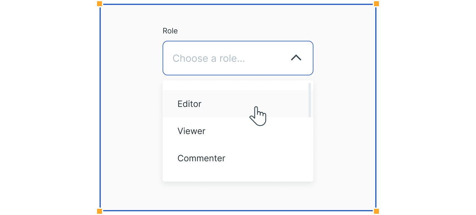
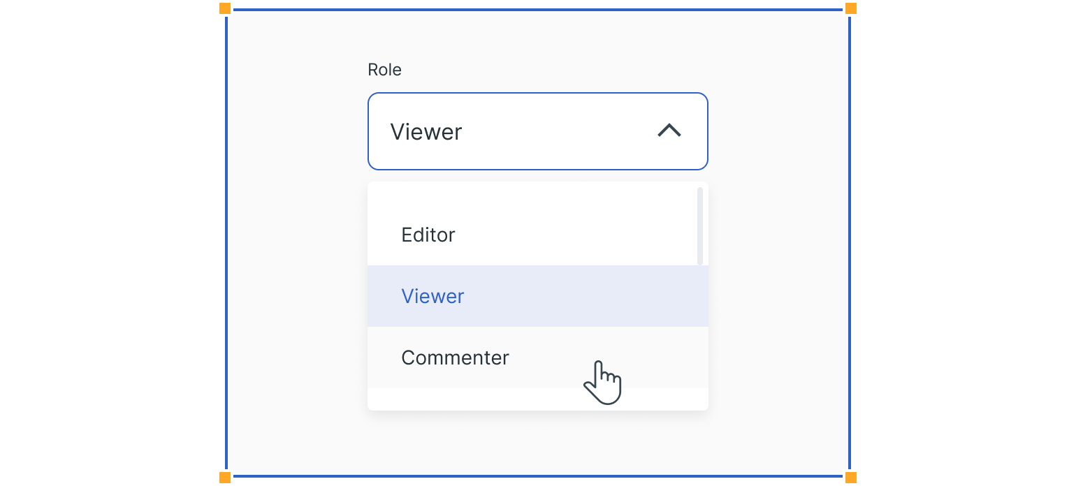
Dropdowns look very similar to text fields. The main difference is the chevron inside the input container, which opens a list of items. The placeholder text inside a dropdown indicates that users need to make a selection from that list. It’s then replaced with the selected item.
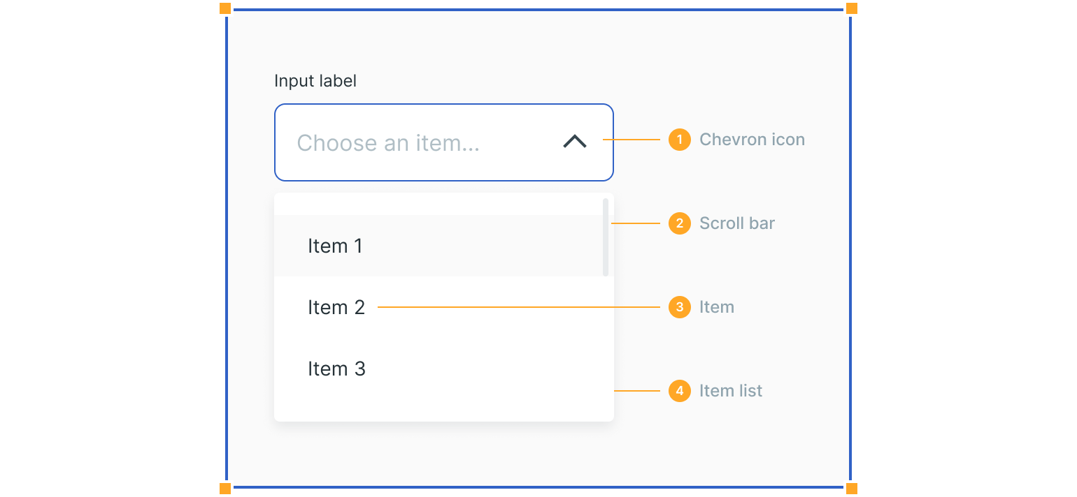
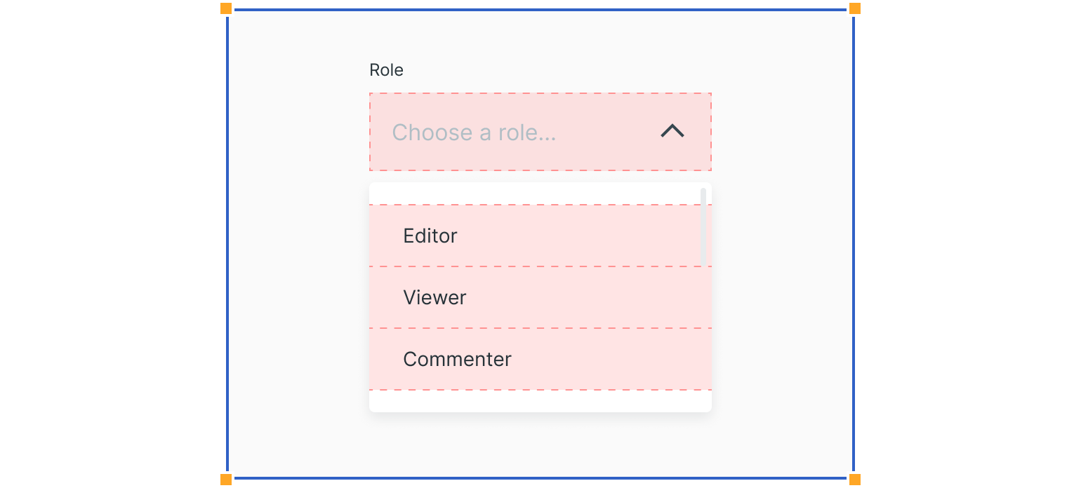
1. Chevron Icon
This icon indicates that users can expand the dropdown by clicking on the icon or the input field.
2. Scroll Bar
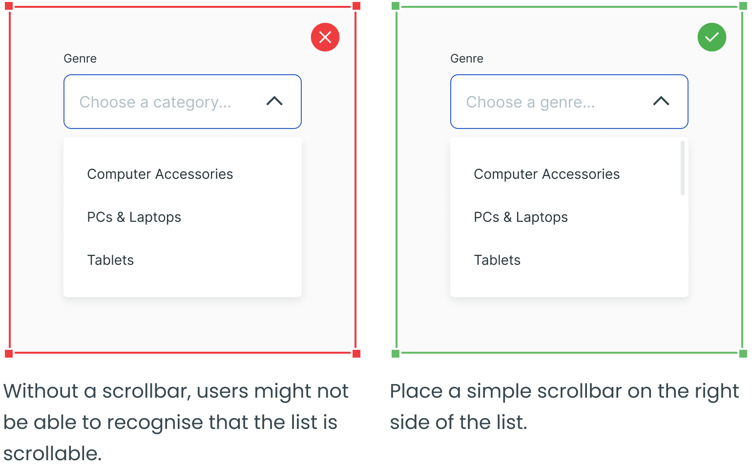
Scroll bars indicate that lists are scrollable.
3. Item
This is an item that the user can select.
4. Item List
All items are grouped in a list, which the user can select from while scrolling through.
States
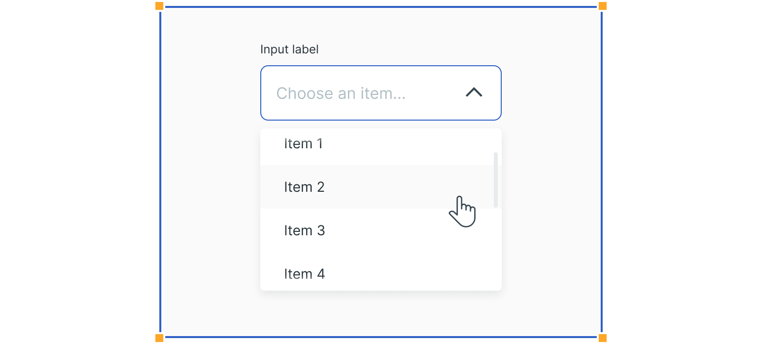
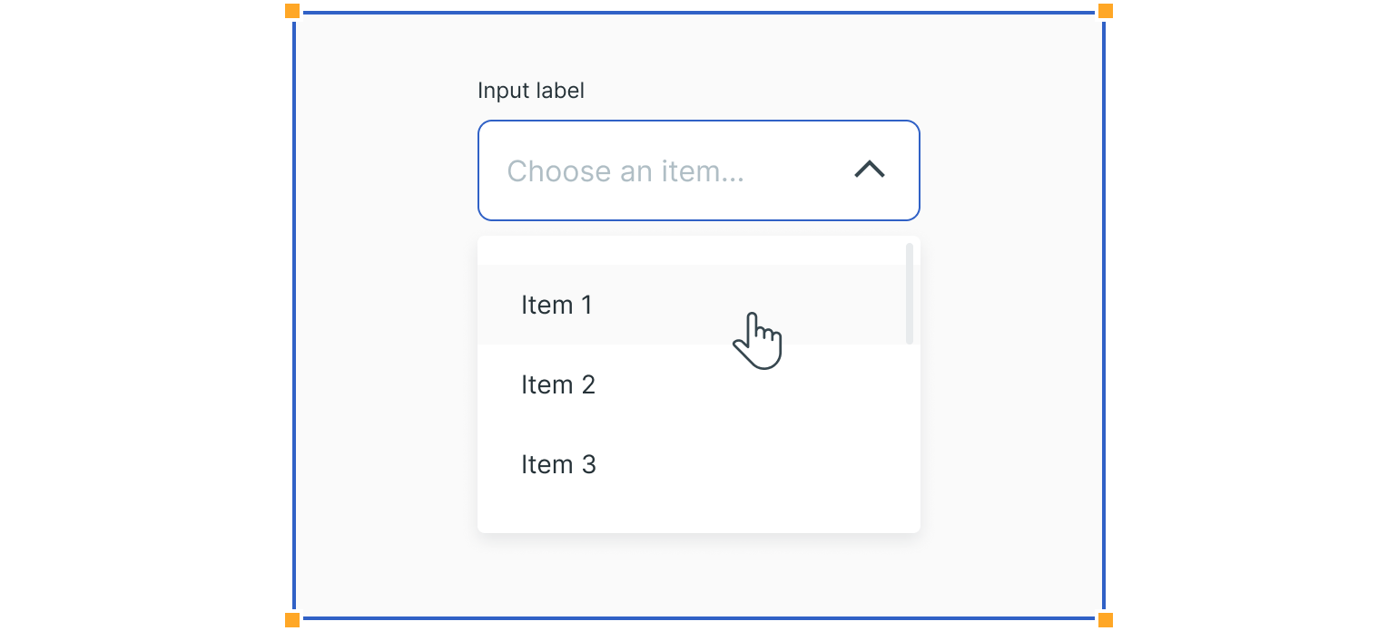
Dropdown states are similar to those in text fields. The main difference is the dropdown focus state, which features a list of items.
Additional states like the hover and selected state for specific item rows are also required.
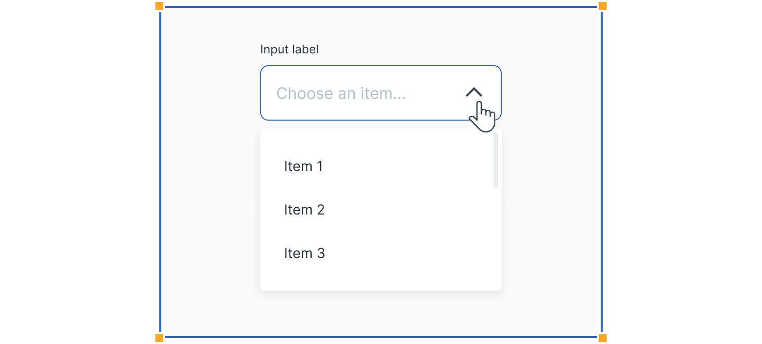
Interactions
Users trigger a dropdown list to open by clicking the chevron icon or anywhere else within the field. They can then close the list by clicking the chevron or clicking anywhere outside the list.
Dropdown Types
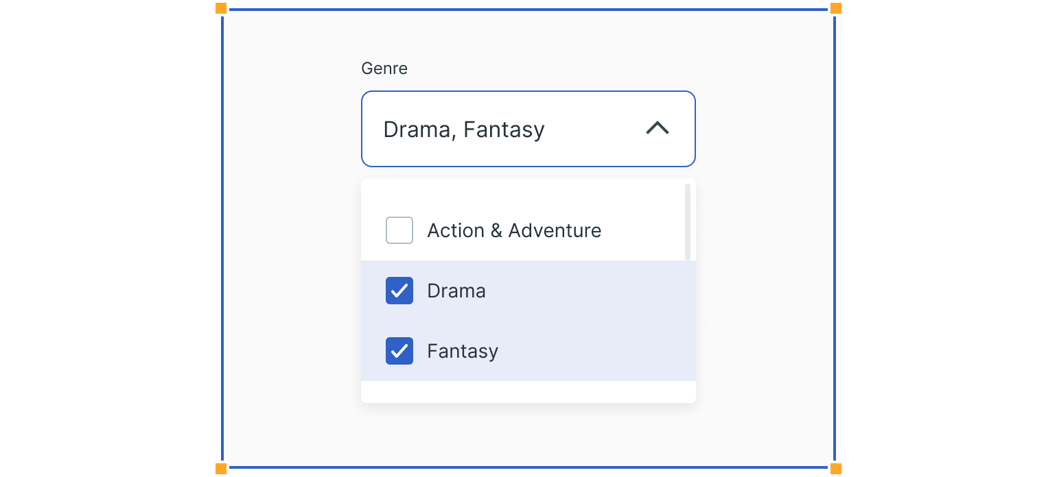
Multiselect
This type of dropdown is used when we select multiple options from the list, like filtering information. Each item on the list contains a checkbox to the left. Because multiple options are available, the list does not close when users make selections.
Combo Box
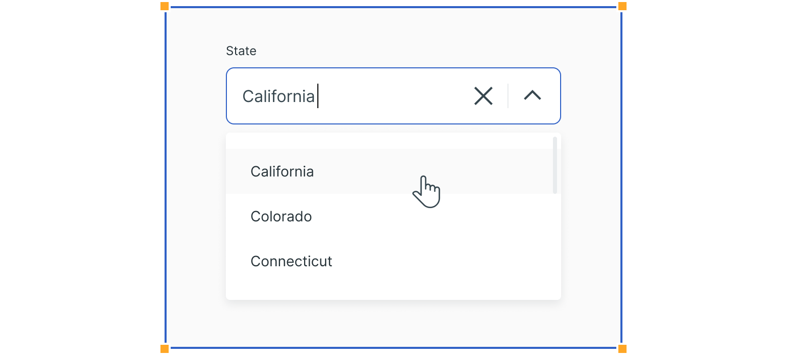
This type of dropdowns allows users to make a selection from a prefilled list of options. It is typically used when there is a large number of options to choose from.
The list opens by clicking anywhere in the field. Then you can start typing in the placeholder text to sort through the list of options.
Selecting an option closes the menu and the chosen option replaces the placeholder text.
Usage
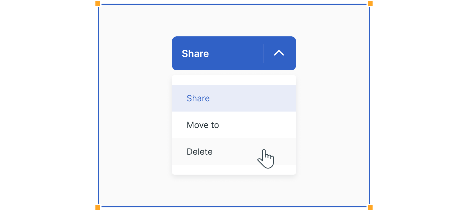
Command Lists
Dropdowns are often used in UI, where there is little room to fit all buttons and commands. In such cases, these can be grouped and presented in dropdowns which initiate an action based on the selected option.
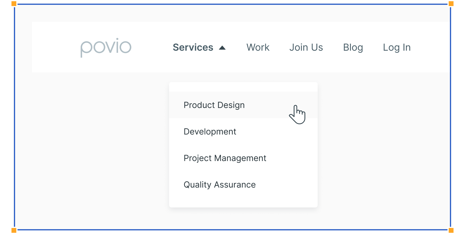
Navigation Lists
When there are many links in the navigation row, it’s a common approach to group them. However, these dropdown lists are specific since they do not inflict changes on the existing page but rather lead users to a new page.
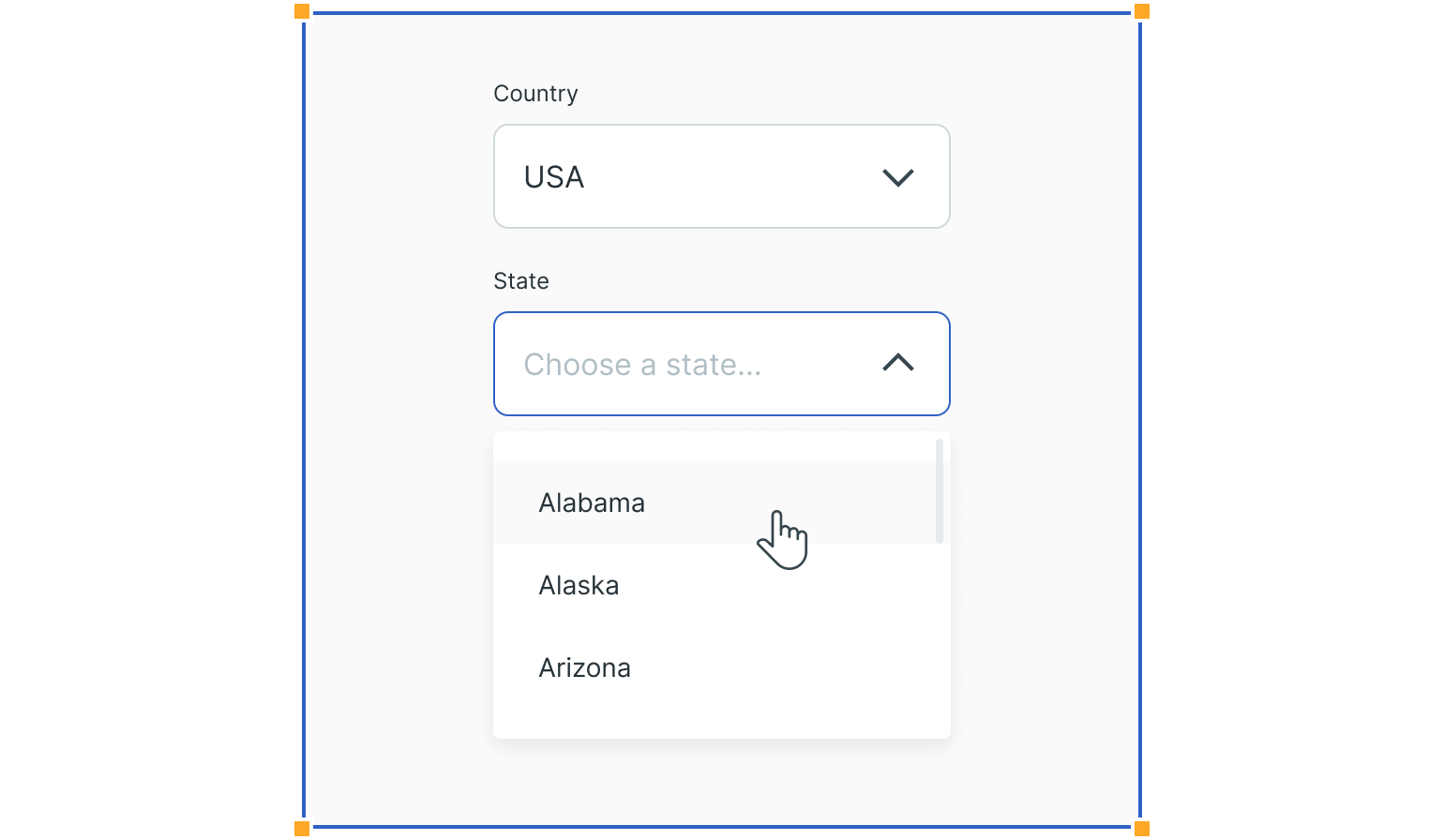
Form Filling
Dropdowns are used in forms when users have to make a selection from a long list of items. When used this way, they preserve lots of vertical screen space.
Guidelines
Here are some examples of how to use dropdowns and what to avoid.
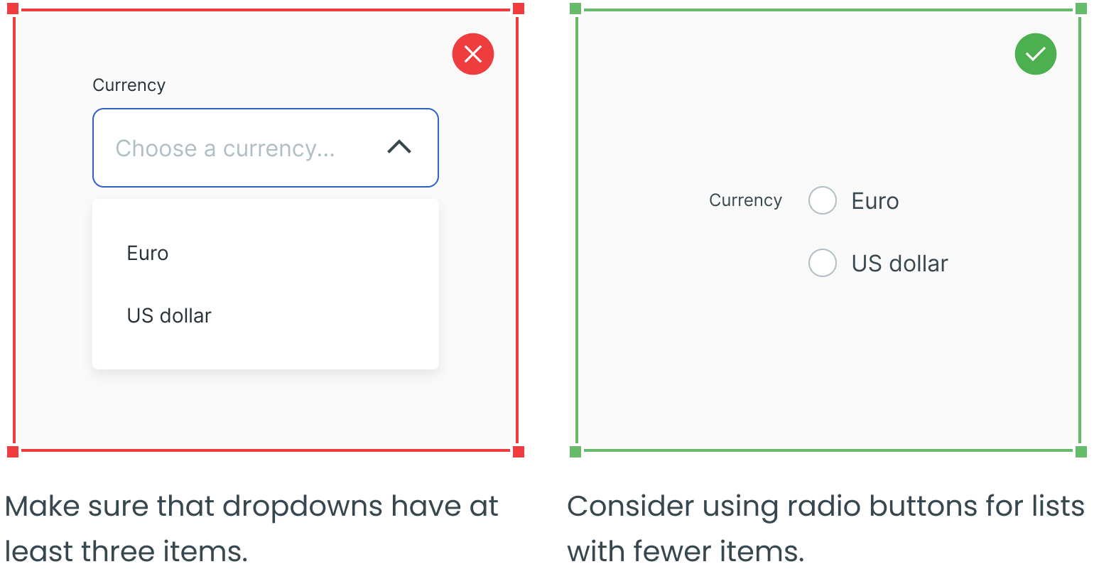
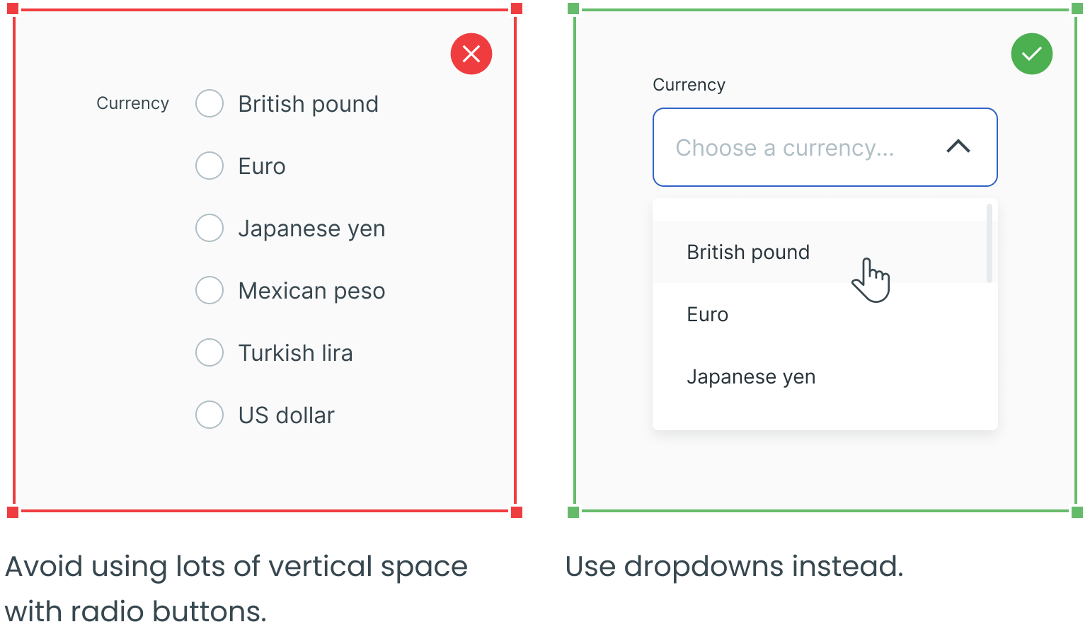
Avoid Dropdowns for Short Lists in Forms
Use Dropdowns for Long Lists
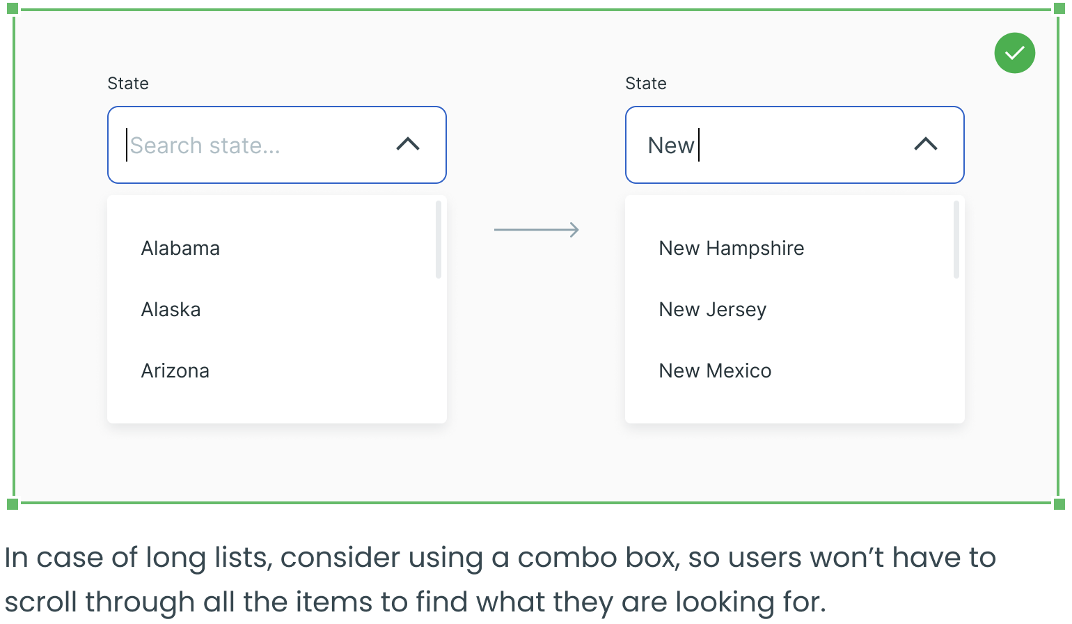
Consider Using a Combo Box for Long Lists
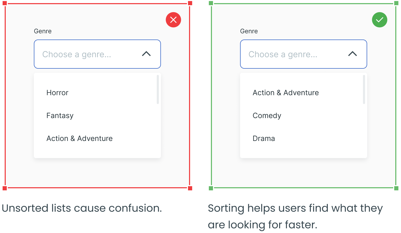
Sort the Dropdown List Alphanumerically by Default
Use a Scrollbar Inside the Dropdown List
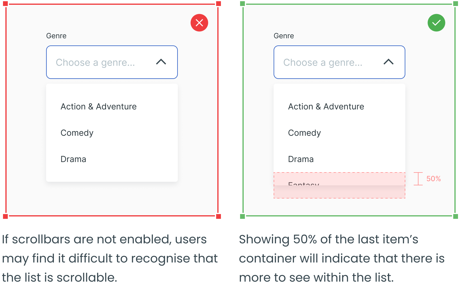
Show at Least 50% Of the Last Item
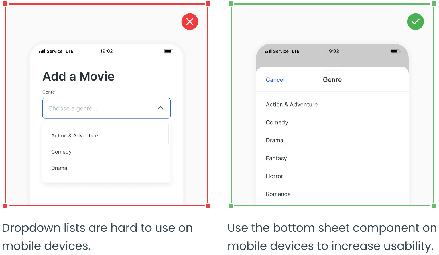
Restructure Dropdown Lists on Mobile
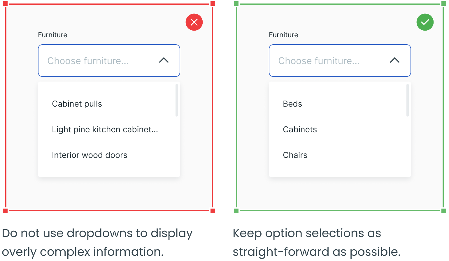
Keep Option Selections as Straightforward as Possible
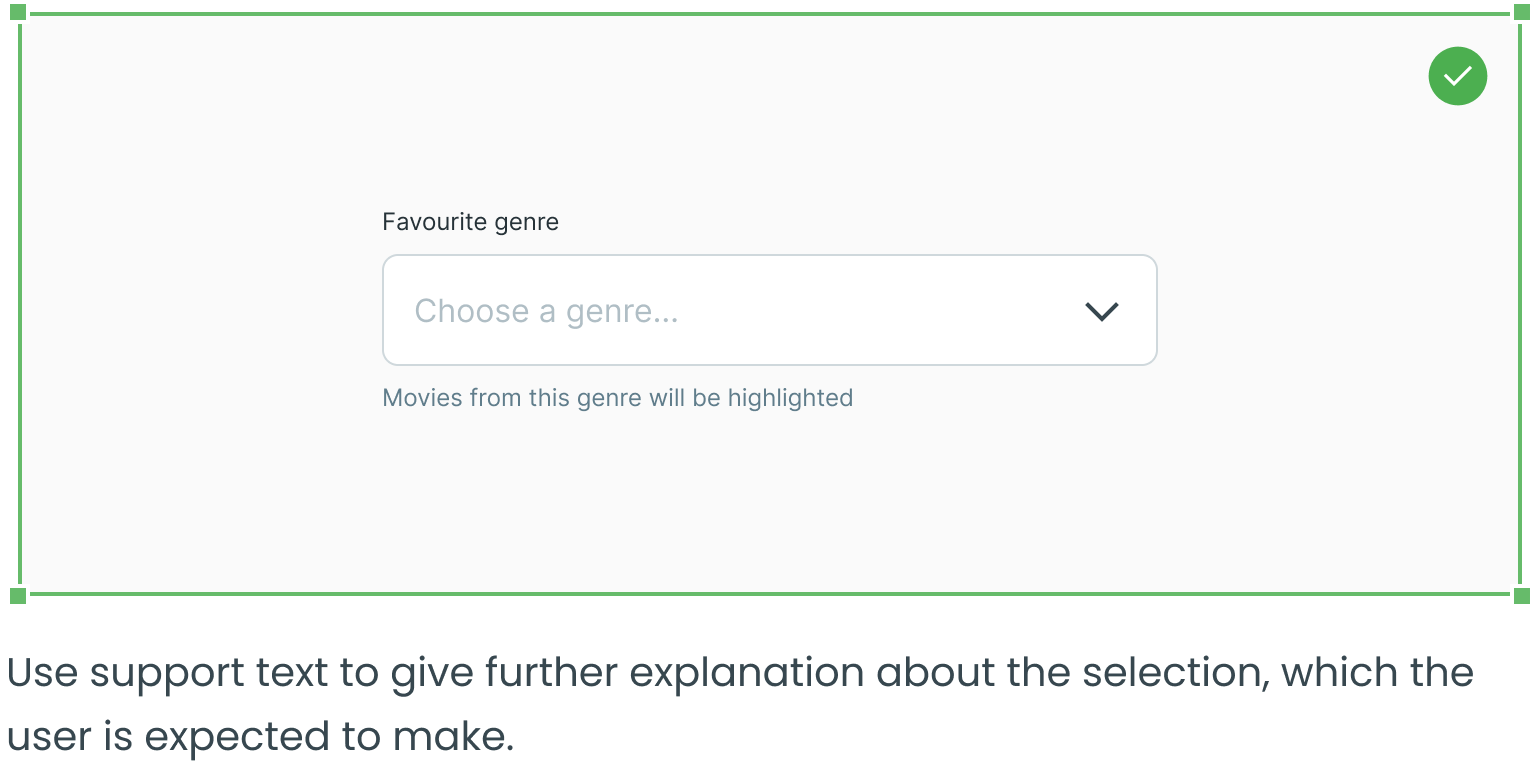
Consider Using Support Text
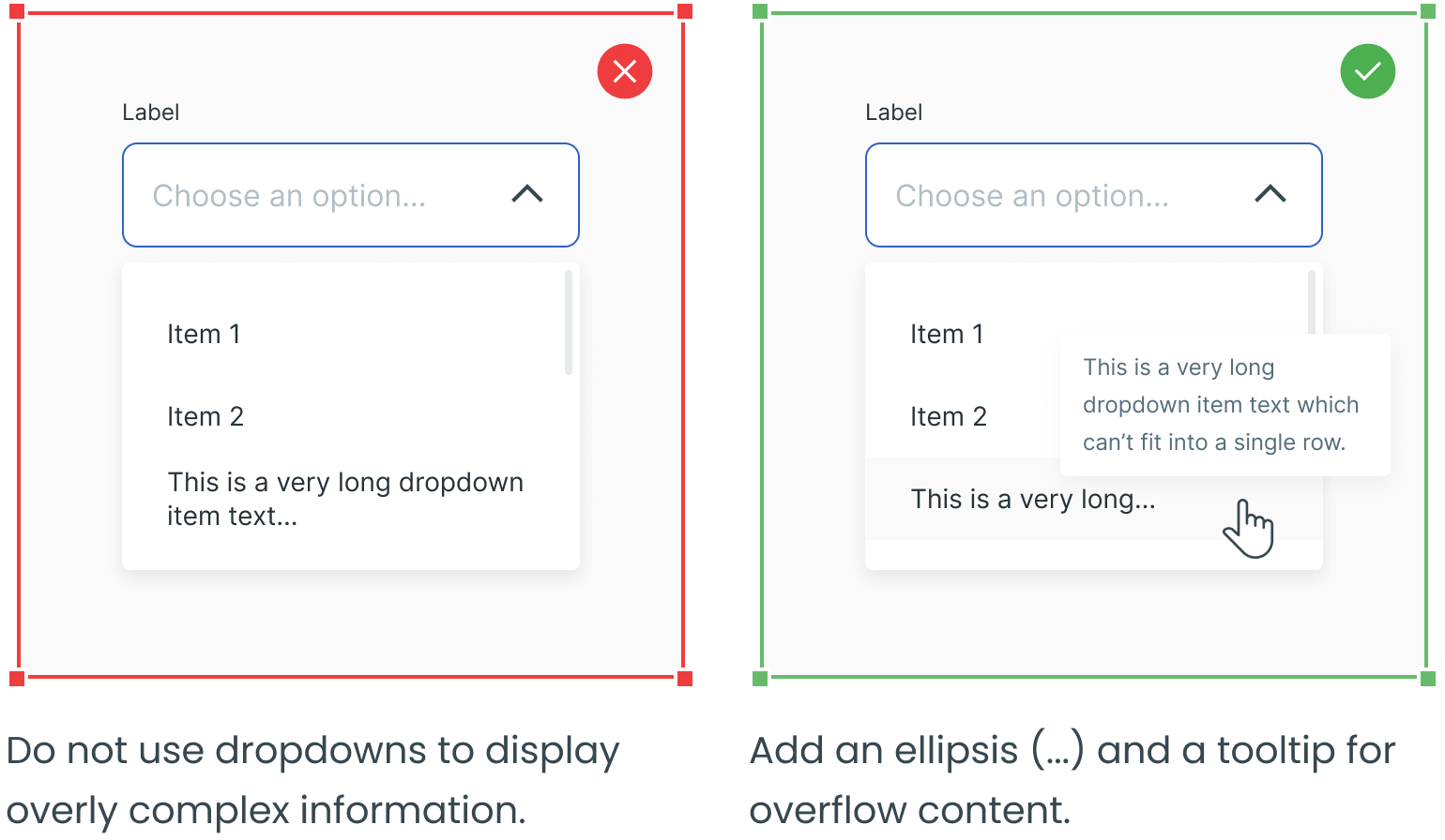
Avoid Multiple Lines of Text in Dropdown Lists
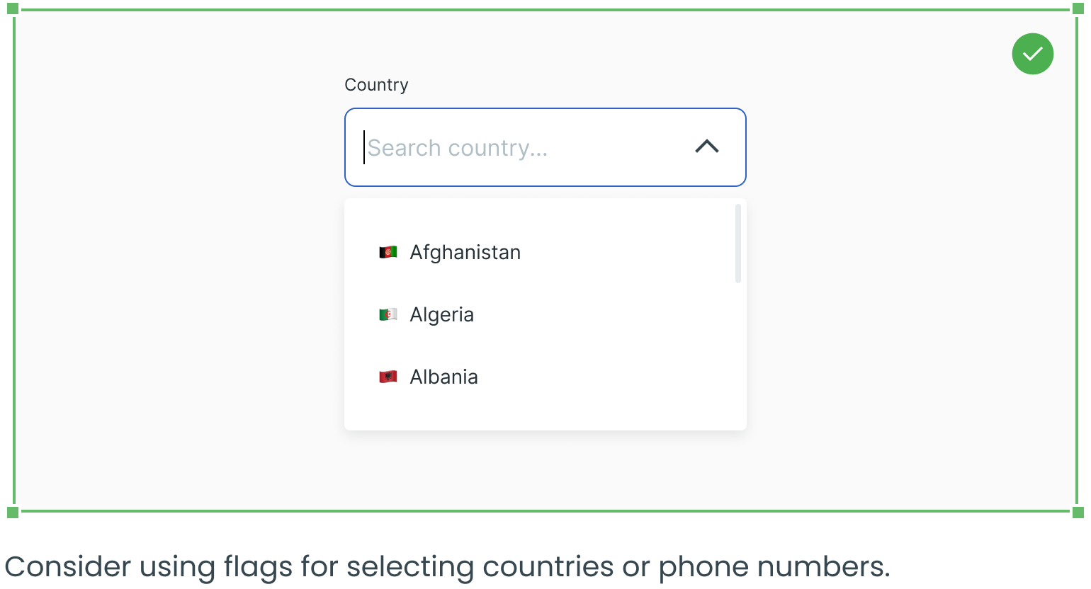
Consider Using Flags
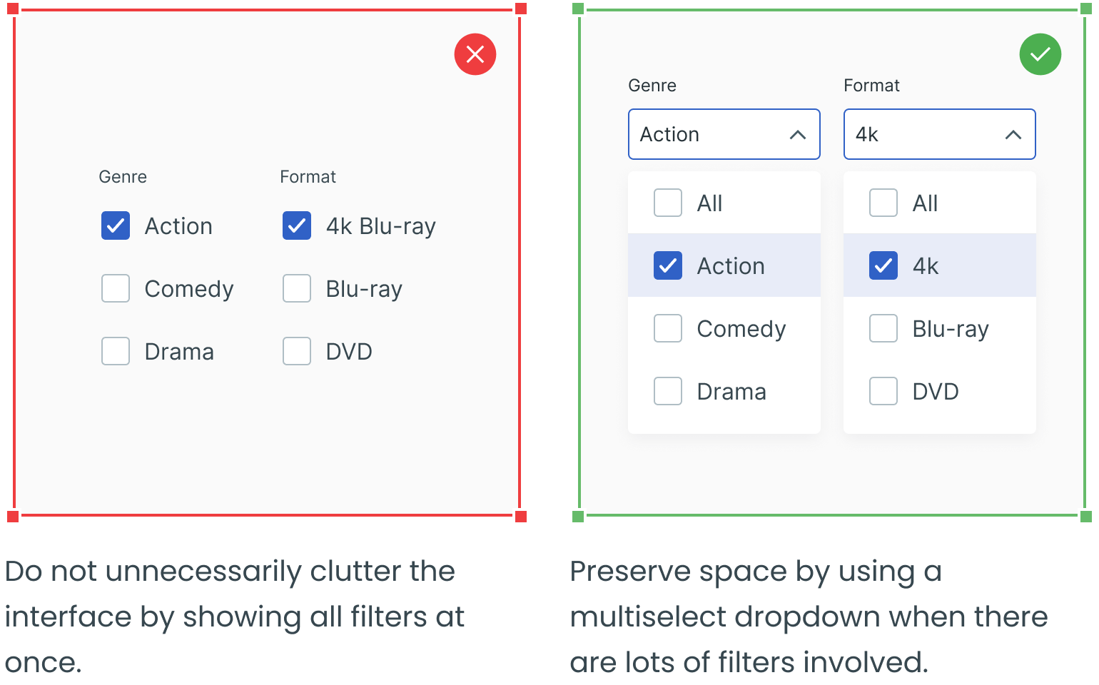
Use Multiselect Dropdowns for Complex Filters
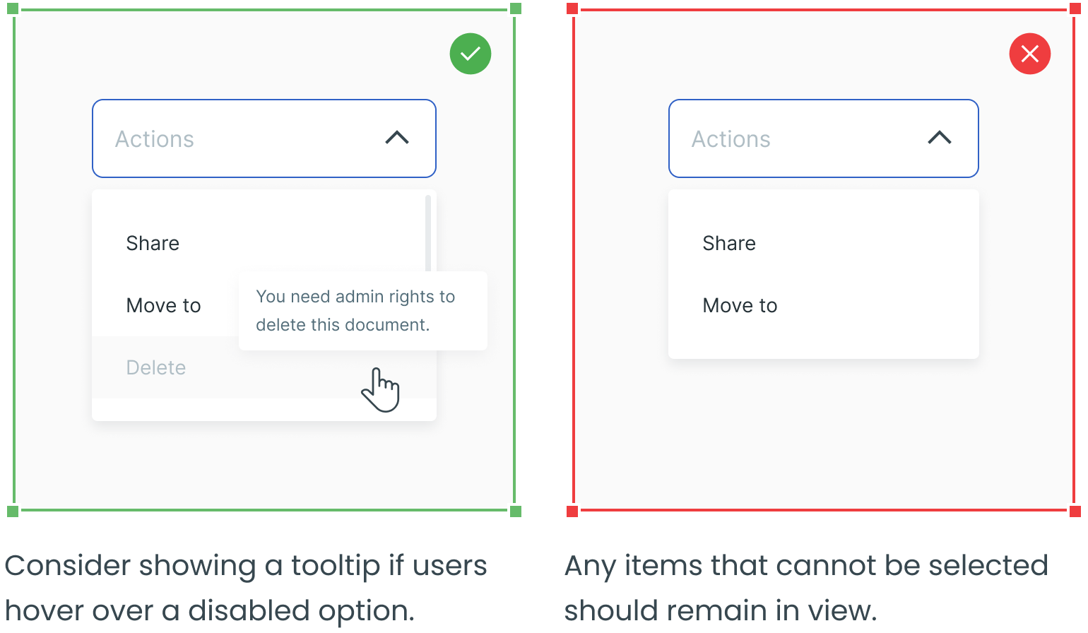
Gray Out Any Unavailable Options
_________
Text fields, radio buttons, checkboxes and forms are four other essential user interface elements you should be familiar with in addition to dropdowns.
Check out the rest of the series for more information on each design element, as well as guidelines for their use:
