Design Snippets is an educational mini-series of blog posts describing all you need to know about basic elements and components of user interfaces from a design perspective.
A snippet is a programming term for a small region of re-usable source code, machine code, or text.
To kick off the series here is all you need to know about one of the most used design components out there – text fields. Look no further for an overview of their structure, different types, and, most importantly, tips on using them correctly and what to avoid.
Overview and Structure
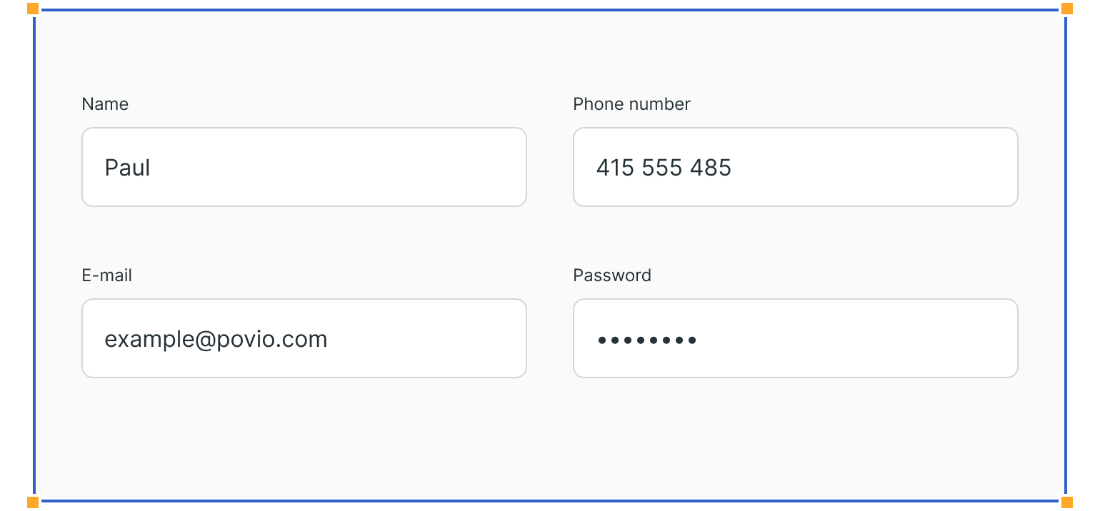
Text fields are the most common elements in forms. They have a standard structure, which the users recognise and understand.
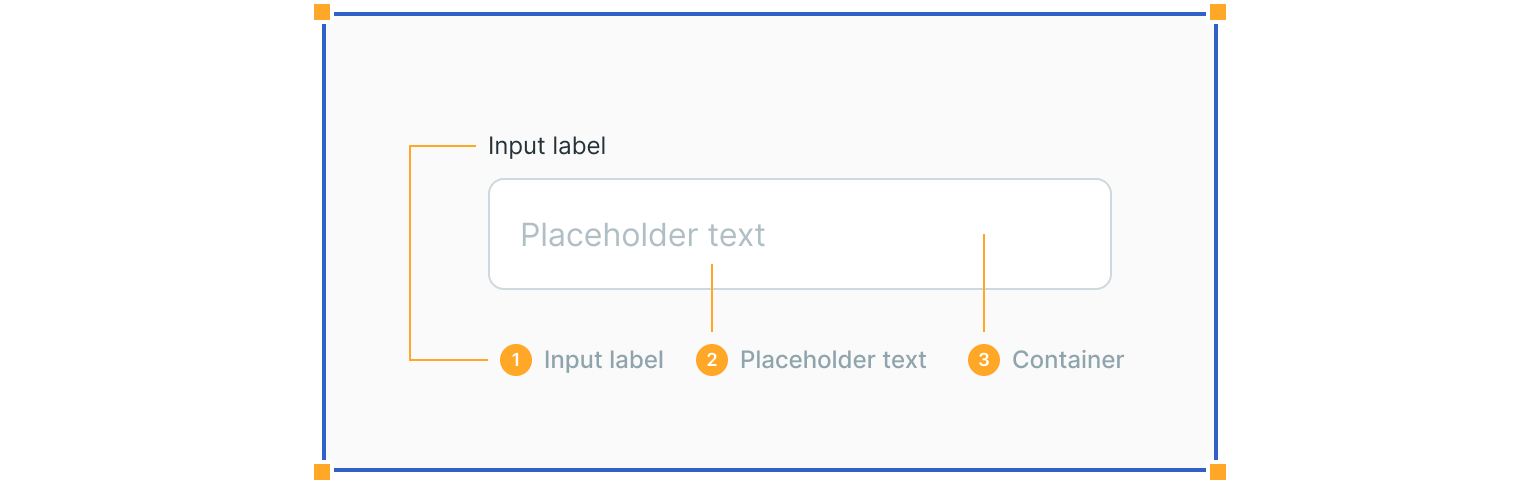
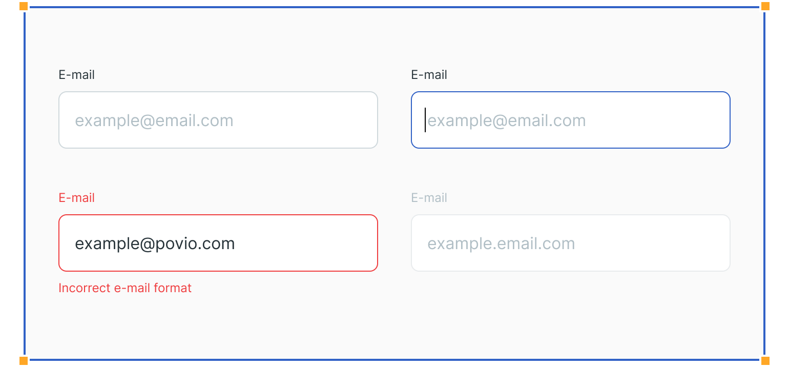
1. Input Labels
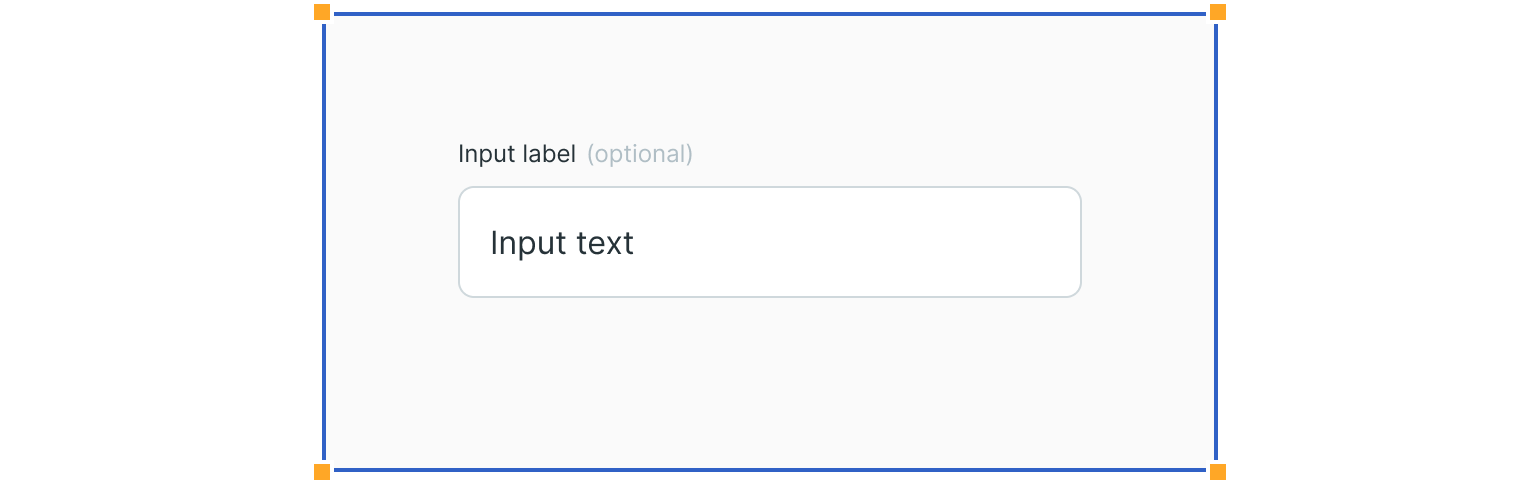
Input labels explain the type of information, which the user is expected to insert. For example, if the field is optional or mandatory, this can be communicated via the input label.
2. Placeholder Text
Placeholder text gives an example of the answer which is expected from the user.
3. Input Container
Input containers separate text fields from the background. They also provide visual feedback via error, disabled & focus states.
Text Field Types
Different text field types can display inputs in two different ways: using single or multiple lines of text.
Single-Line Text Fields
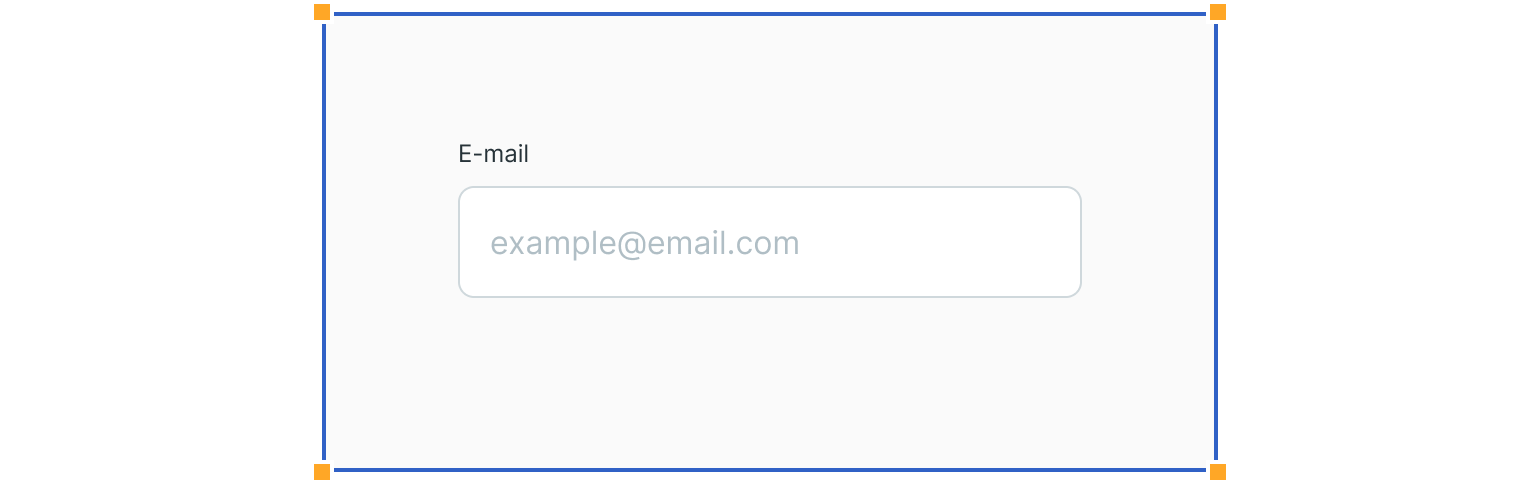
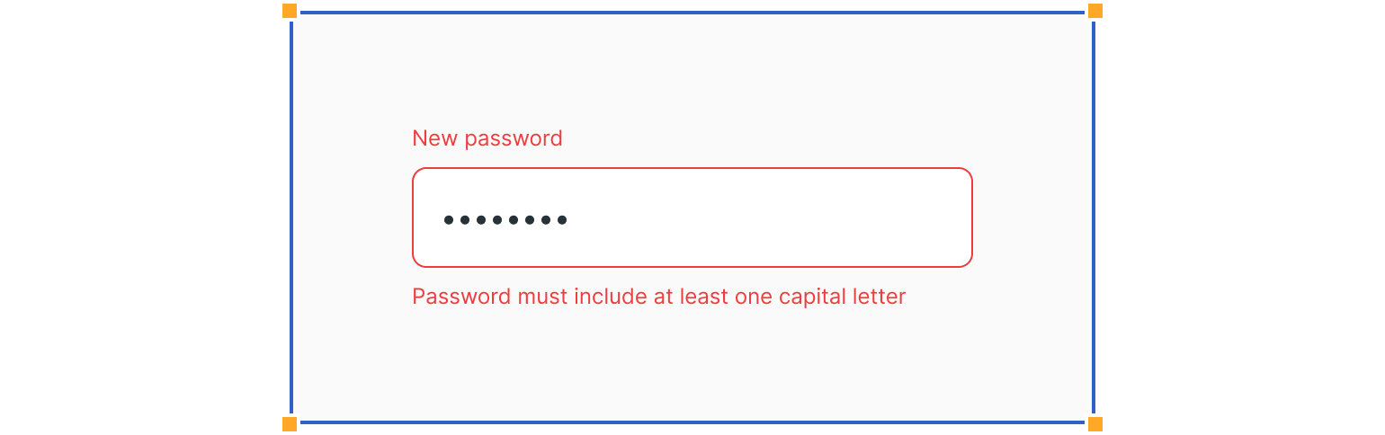
Single line text fields can be used to get various types of data from the user. Many fields hold just text and numbers, but password fields hide them under dots.
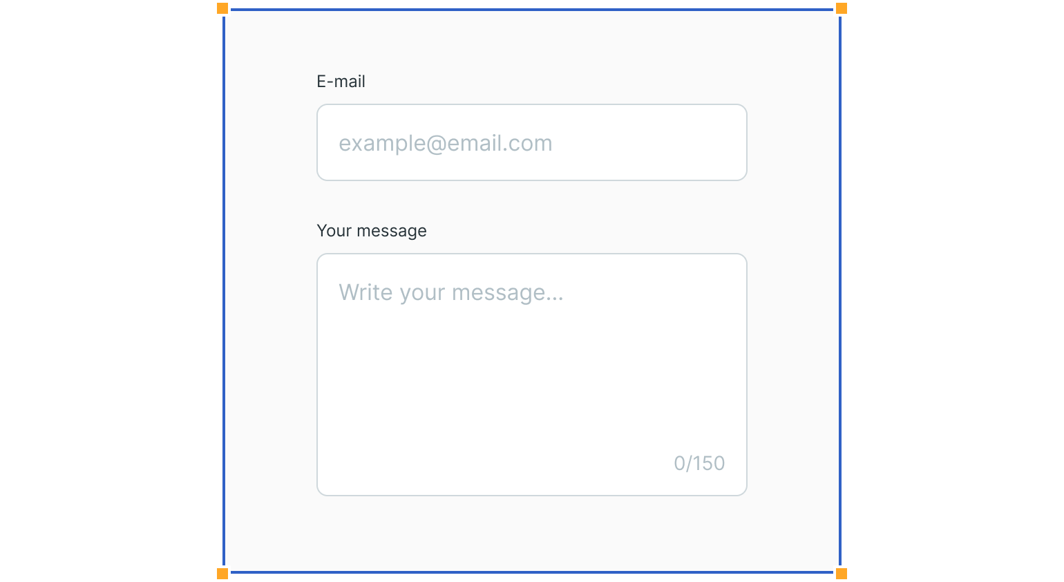
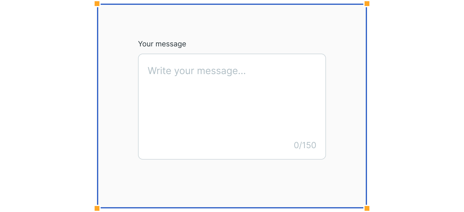
Text Area
Input fields with several lines of text in a fixed height container. The initial size indicates that longer responses are possible.
Text Field Styles
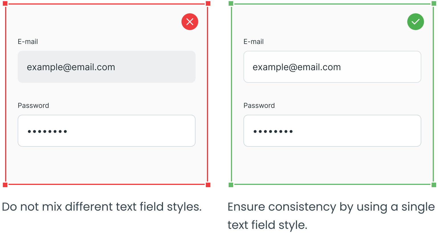
Several text field styles can be used. Just make sure to use only one in the same interface.
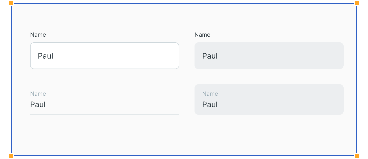
States
States provide visual feedback to the user. Therefore, they are an essential part of interactive components, such as buttons and text fields.
Usage
Here are some examples of how to use text fields and what to avoid.
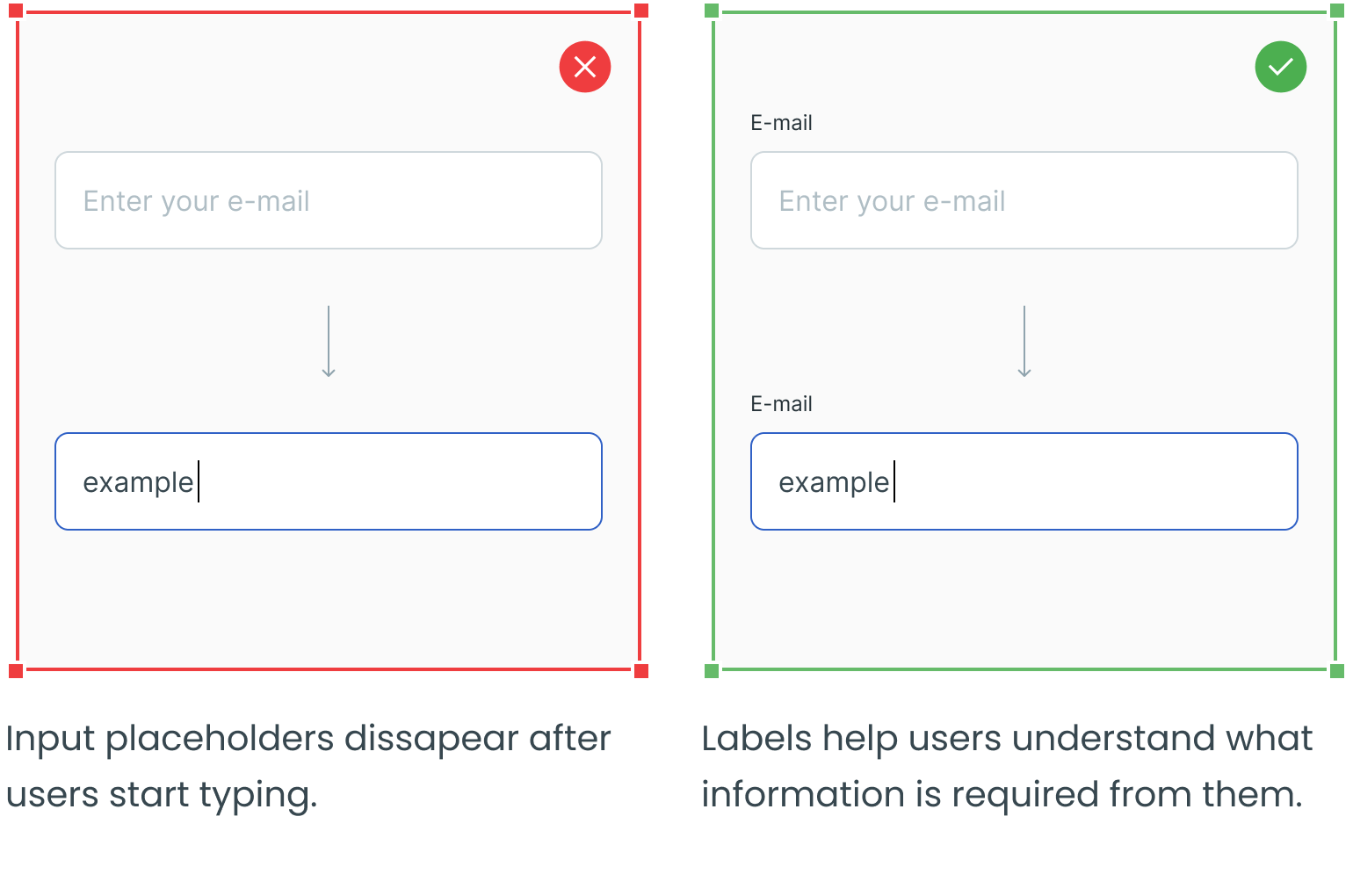
Avoid hiding labels
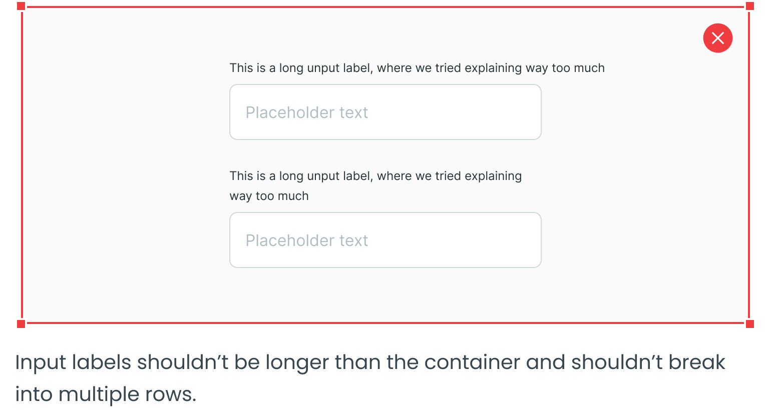
Avoid Using Long Labels
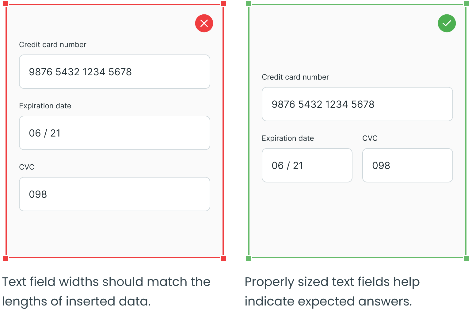
Use Proper Width
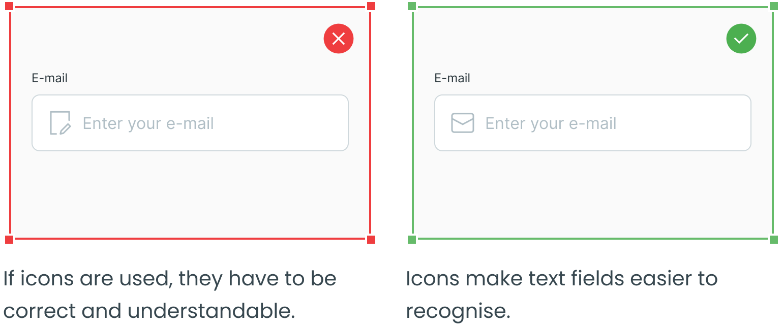
Consider Using Icons
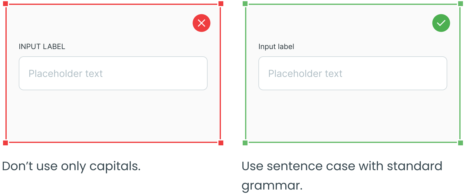
Use Sentence Case
Do Not Mix Styles
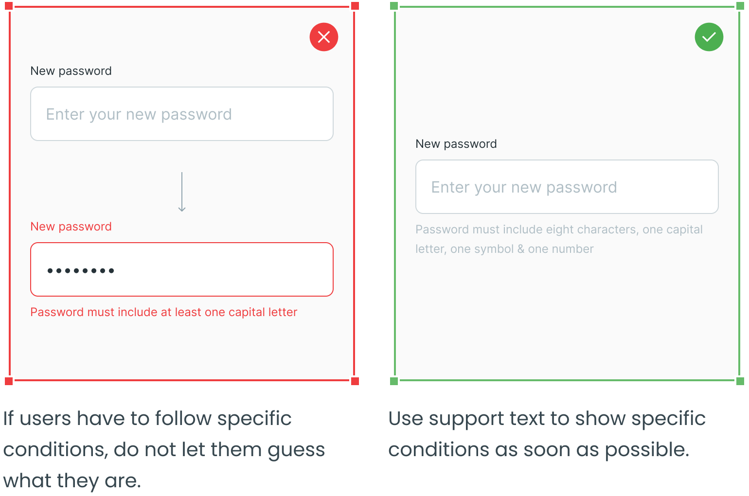
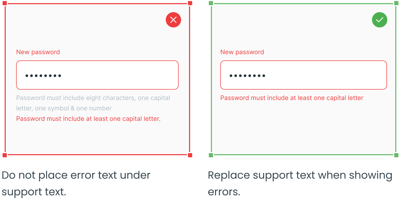
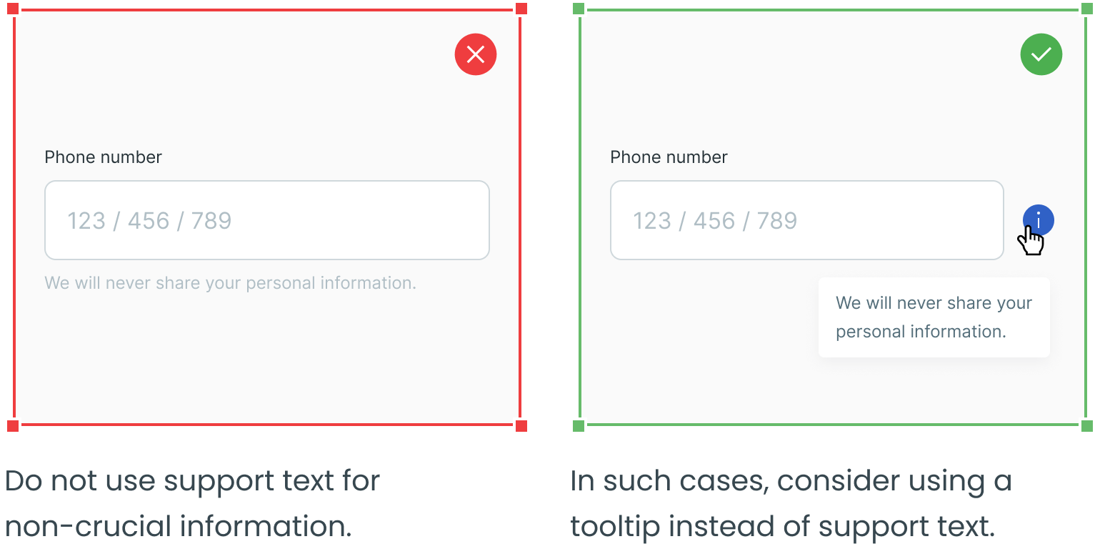
Consider Using Support Text for Specific Conditions
Error Text
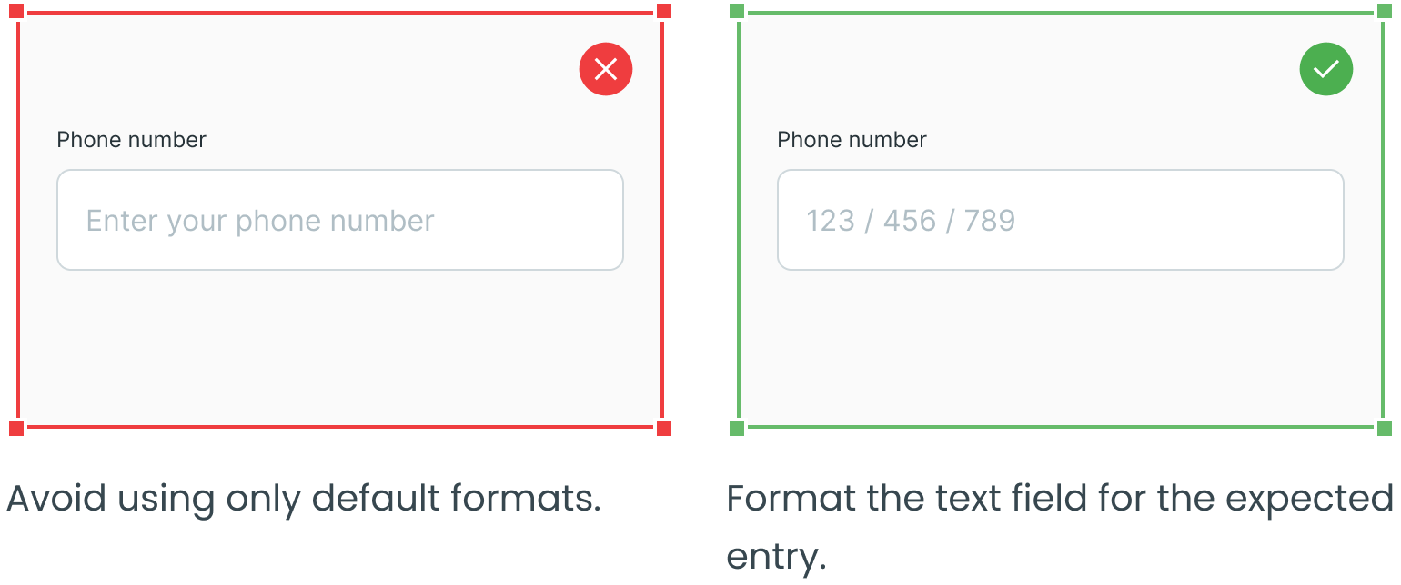
Use Proper Text Field Format
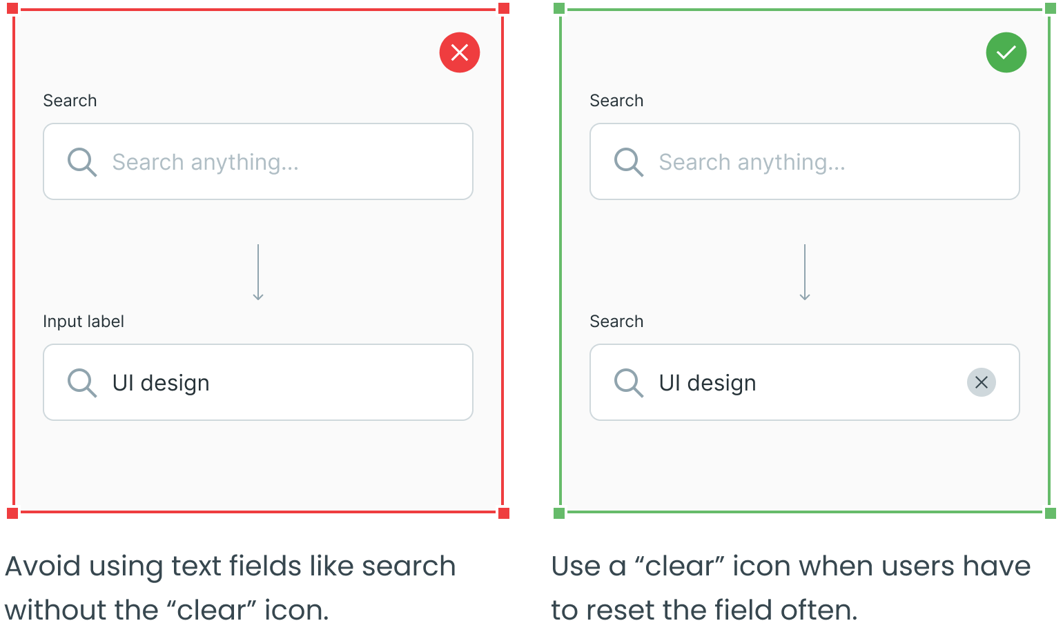
Consider Using a “Clear” Icon
Consider Using Tooltips
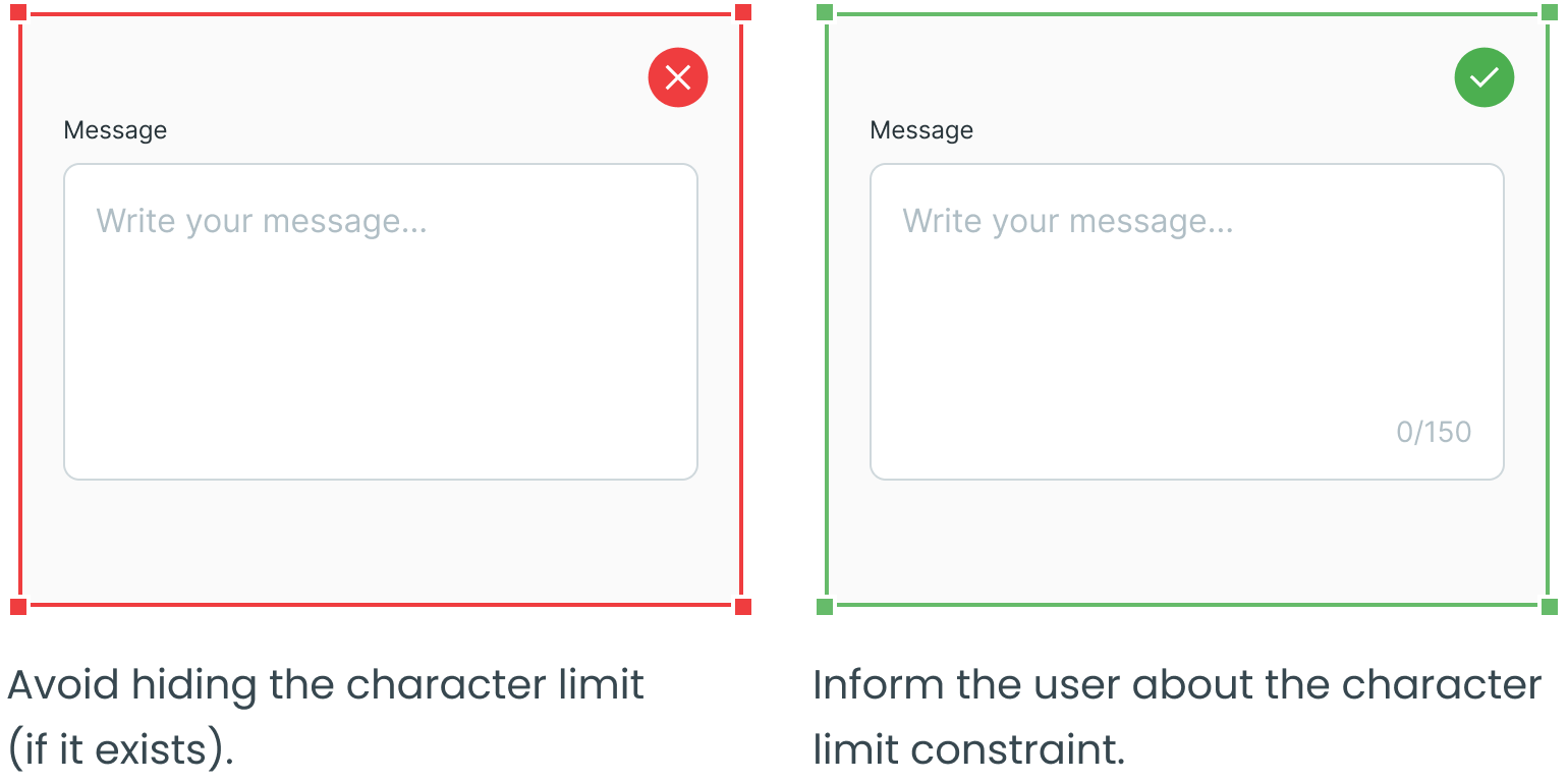
Maximum Character Limit
_________
Dropdowns, radio buttons, checkboxes and forms are four other essential user interface elements you should be familiar with in addition to text fields.
Check out the rest of the series for more information on each design element, as well as guidelines for their use:
